Usability Review and Recommendations
Client: Foodsby
Date: 2018
Brief: Foodsby is a service for the modern workplace professional who wants to order lunch and have it delivered to their building. Foodsby's website was evaluated for usability considerations to improve their ability to grow and retain their customer base.
Research Methods: Heuristic Analysis | Cognitive Walkthrough | Remote and In-person User Interviews
Design Tools: Sketch App | join.me | mural.co | Trello | Axure RP
High Level
Findings:
Usability issues around predictability, user control, and clarity were identified through heuristic evaluation.
Some navigational elements are lacking visibility, resulting in reduced wayfinding capabilities.
Users found the Foodsby service to appear both credible and efficient.
Recommendations:
Work to align the information on the marketing page with what the service provides to relieve dissonance between reality and the mental model of the user.
Provide clearer language in body text and call to actions.
Include more navigational items to provide more user control and visibility.
Research
Research Goals
After an initial look over the website, we went to the whiteboard to help determine some objectives for usability testing. We designed our research protocol around the following goals:
Evaluate the users understanding of the content.
Gain insights on the users thoughts and attitudes towards the site.
Gain insights on the users wayfinding and ability to place an order using the current website.
Usability Testing
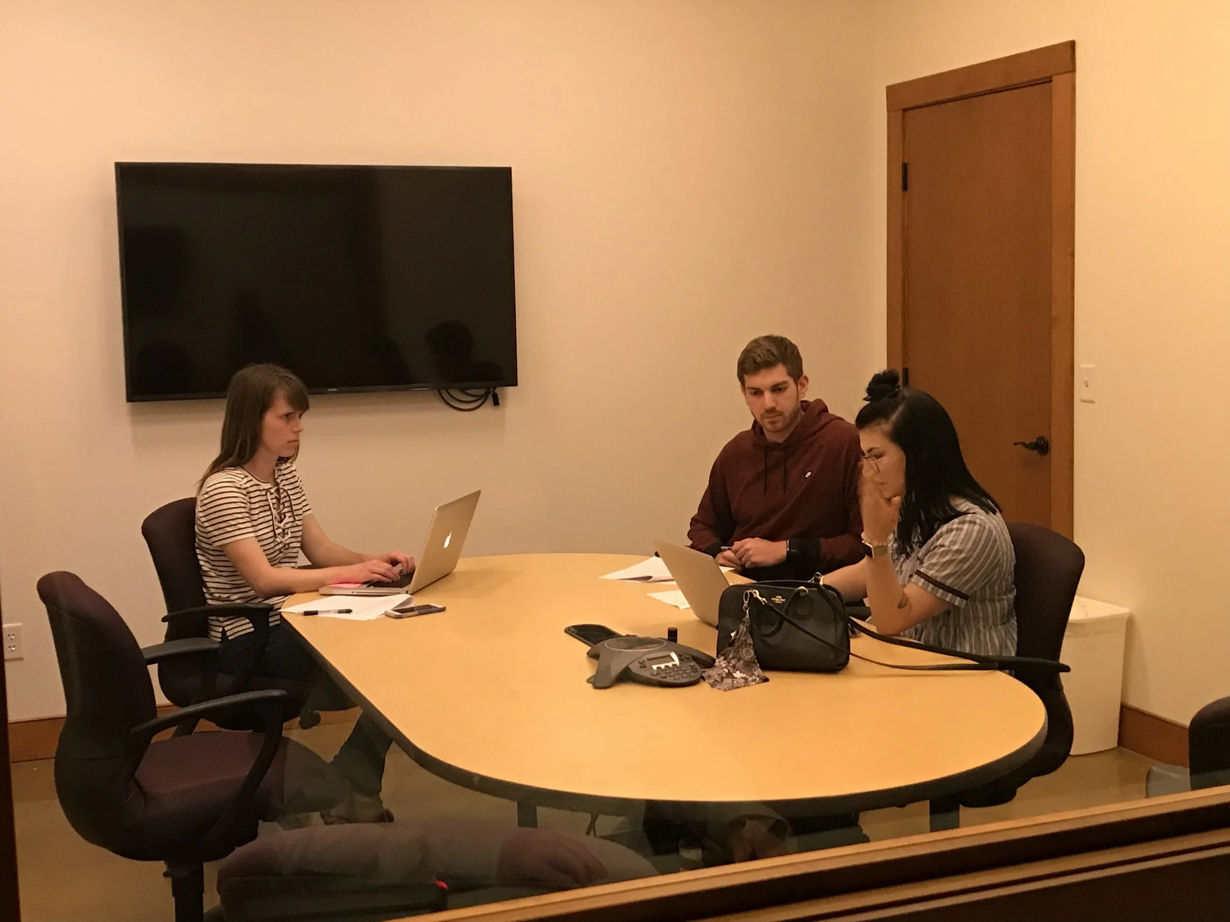
Our team conducted a total of 3 in-person and 8 remote usability tests. Through these sessions, our team was able to identify three concepts to address in our recommendations report.
Most users do not know what service is being provided or how to use the site when first arriving at the marketing site.
The limited selection of restaurants is surprising to most users when they login.
The users expectations for delivery do not match what actually happens.
Recommended improvements from heuristic evaluation:
Reference: 20 Usability Heuristics (Weinschenk and Barker 2000)
Heuristic Evaluation
Overall, we determined that the Foodsby website conforms to the heuristics. However, the following analysis will detail some areas that can be improved upon for future iterations. Task flows that are working:
Signing in to an existing account: This process is easy to understand because of the clear dialogue chosen that walks the user through the process.
Selecting items to be ordered.
Completing the order and checkout process: leverages usability conventions well.
Contacting customer service is straight forward. Works as expected.
Summary
While there were a lot of good things on with the Foodsby website, one of the key takeaways from our testing was that many users would get confused on how to proceed when they first arrive at the website. Breaking down the visual hierarchy of the home page and allowing for increased visibility of the website navigation could help with this.
Additionally, while the intent from Foodsby is that the user gets to the site primed with an understanding of how to use the platform from their business managers, clarity in the information architecture can alleviate uncertainty throughout the experience and foster trust. However, the efficient check out process and simple layout is a win, as most users commented on the professional appearance and quick interactions.
Following Up
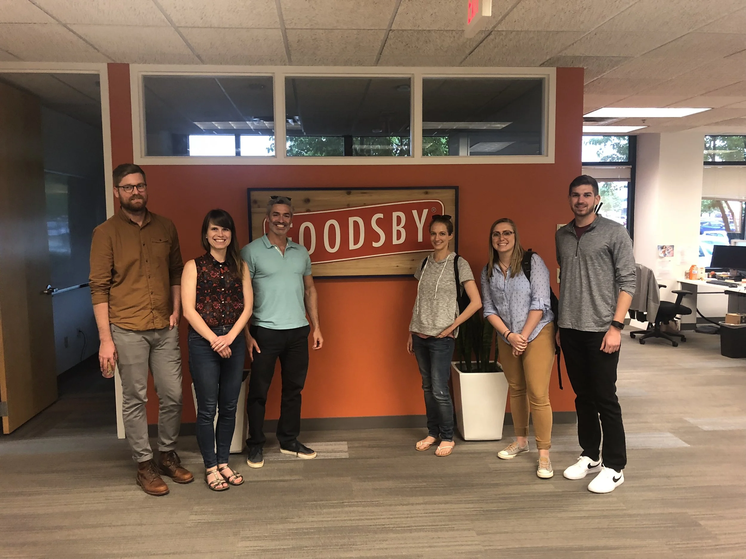
After reporting our findings to the Foodsby development team, a couple of us had a great opportunity to sit in with the team and CEO to go over our recommendations. The experience provided great insight into working within business and technical constraints while still balancing the needs of the user. It was a great way to round out our consultation and wrap-up our service.


