
This case study of Aerolytics was done through Prime Digital Academy as a way to study the user experience design process.
Aerolytics is a airline flight search website that allows you to book flights using your rewards with the best value.

A Case Study
Spencer Sterling
Case study: Aerolytics
The following work on the flight search website Aerolytics was done through Prime Digital Academy as a means for familiarizing myself with the design process and learning some fundamental user experience design concepts.
Some key methodologies used in this study include:
- Directed storytelling and user research.
- Sketching wireframes by hand.
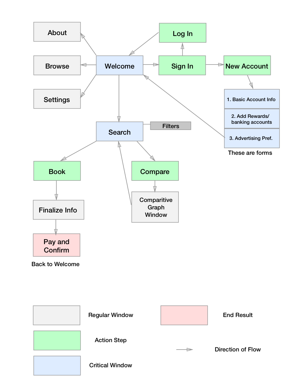
- Creating a user flow map.
- Digitalizing the sketched wireframes in Sketch.
- Producing an interactive prototype with Axure RP.
- Conducting usability testing on the prototype.
- Writing a user report summary.
Some key things I learned along the way:
- Do not get stuck on details, especially when you are early on in the design process.
- Focus your efforts on the user goal.
- Listen to your users.
User research
User Goal: My user wants to find economical flights that best fit their agenda through simplified and comparative data visualizations on the website.
Through means of directed storytelling, I was able find out that my users have several rewards cards. They feel uncertain that they are buying a good flight using their rewards. They also prefer certain airlines when they fly, so being able to filter the available flights by airline is important. They gain confidence in their purchase when they know exactly how much they are paying, and all of the information (such as time, airline, status, etc.) is available to them.
Digitalized Wireframes
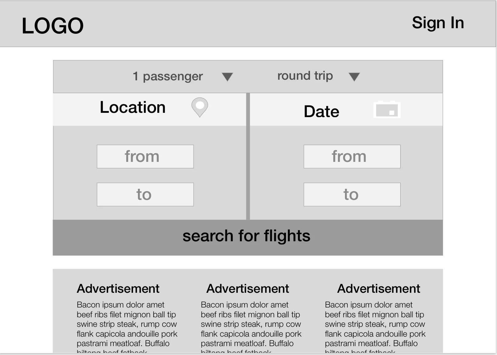
home page
On the home page, I wanted minimal amount of distraction. The users options were then to either:
- Sign-in or sign-up
- Browse flights
- Browse ads and deals
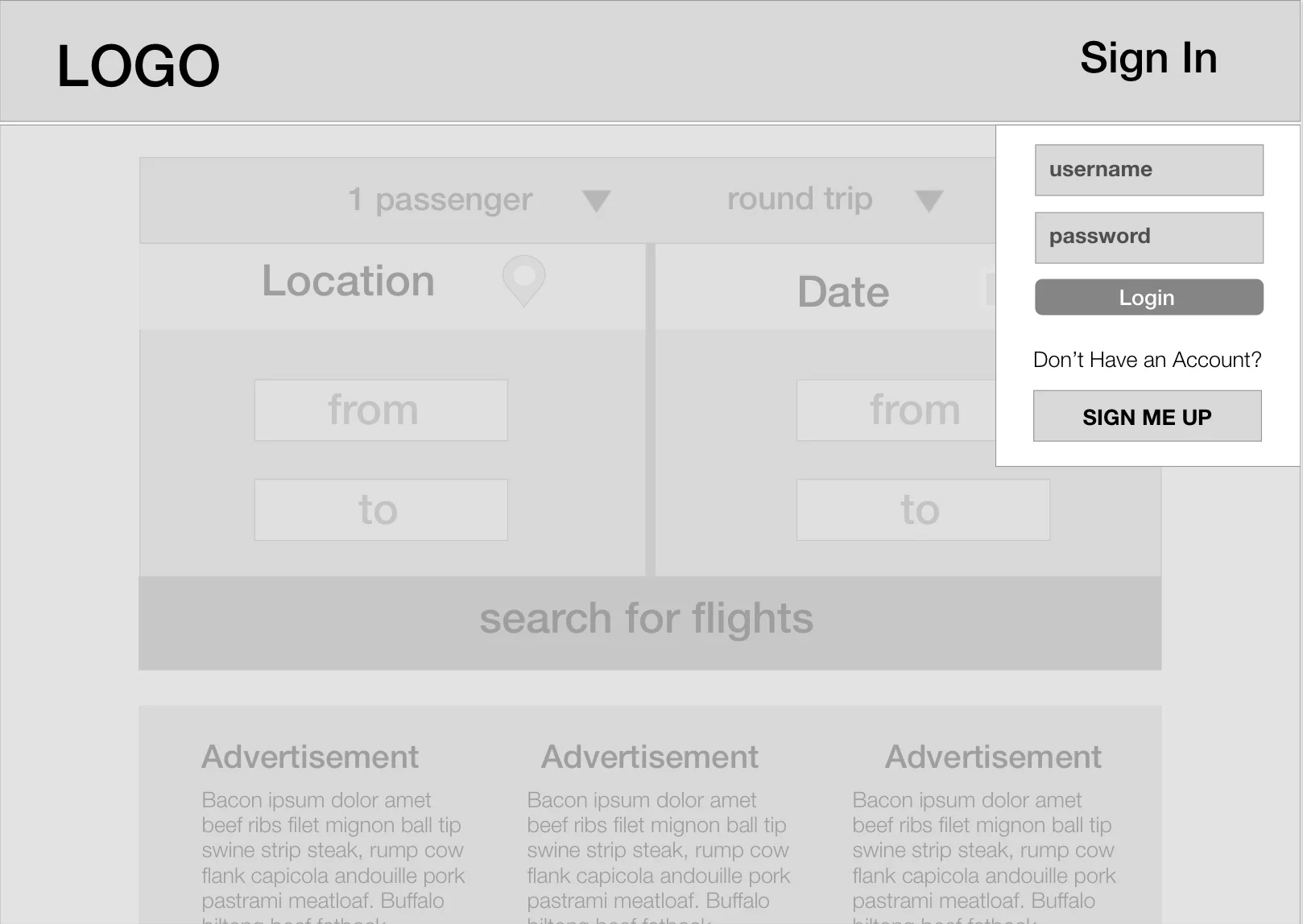
Sign in page
This page illustrates the interaction where a user chooses to sign in. The rest of the screen would darken to focus the users attention.
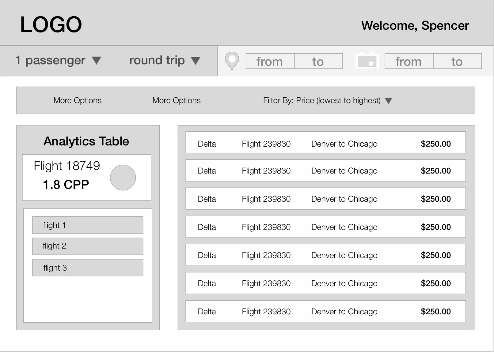
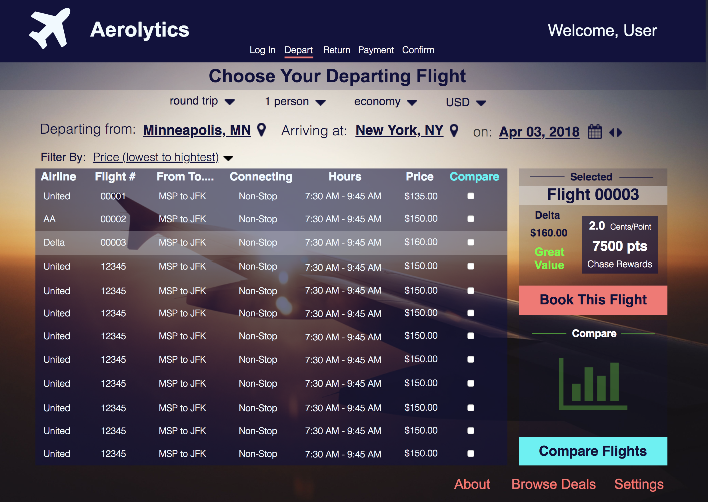
flight search page
On this page, the available flights will be listed on a table with relevant flight information. There is also a table that analyzes prices and makes the comparison process easier when looking between multiple flights.
Digitalized compositions

The home page
The flight search page
This page tried to encompass all important features when looking through and comparing flights.
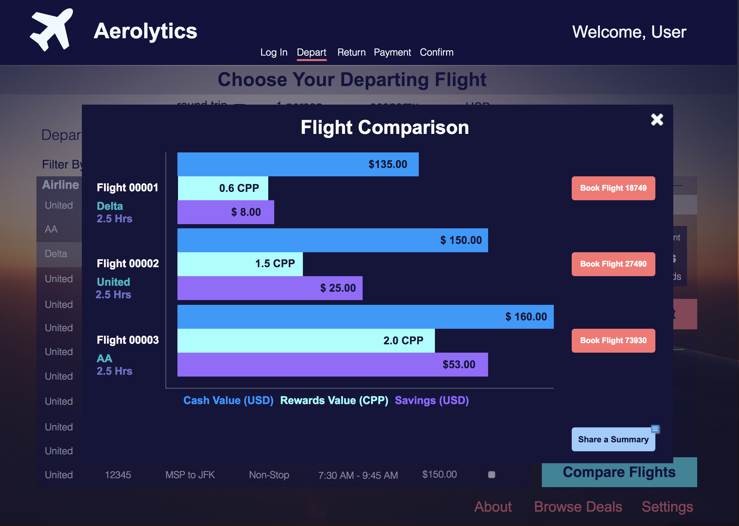
The analysis table
In this frame I tried to allow for a quick visualization of the pros and cons per flight.
user testing
Once the digitized wireframes were made into a working prototype, I was able to get feedback from a small amount of users. Some of the big takeaways from this were:
- The data comparison chart was actually quite confusing unless you knew exactly what you were looking at. Even then, it certainly did not seem to make the process easier.
- Users still feel uncertain as to why a deal was good or bad unless there is an explicit number associated with the savings.
- f
- nfkda;lsj
Concluding Recommendations
Wrapping up my study, I was able to distill out some recommendations for future studies and also some changes to the Aerolytics website.
- Eliminate the whole camparison table. Make an easier way to see